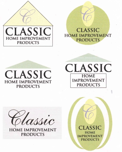
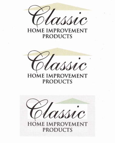
Before settling on the logo we have now, we were presented with alternative ideas that we now can't stop laughing at. No disrespect to the graphic artist. In their defense, it was a long time ago (and it most certainly looks like it).
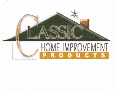
1. The first one looks like Word Art, Windows 98, and dialup somehow collaborated.
2. The second set looks like they could have been early logo ideas for a restaurant with a salad bar.
3. And the last set looks like bootleg versions of our current logo.
We think we made the right choice, don't you?
For your home improvement needs, call Classic! The company with the better logo.

